7 Crypto Chart Patterns For Crypto Trading
Proficient traders worldwide use a combination of technical indicators and chart patterns aiding them to ace the crypto market with hefty profits.
But I know, reading and learning the chart patterns can be pretty intimidating for you. That is why I am here with a concise explanation of everything you would need to know to master reading crypto chart patterns, using them in your trades and boosting your profits.
So, without further delay let’s dive into the topic.
Top 7 Crypto Graph Patterns
- Cup & Handle Pattern
- The Triangle Crypto Patterns
- Rectangle Crypto Chart Pattern
- Flag Crypto Patterns
- Head & Shoulders Crypto Pattern
- Triple & Double Tops/bottoms
- Cup & Handle Pattern (inverse)
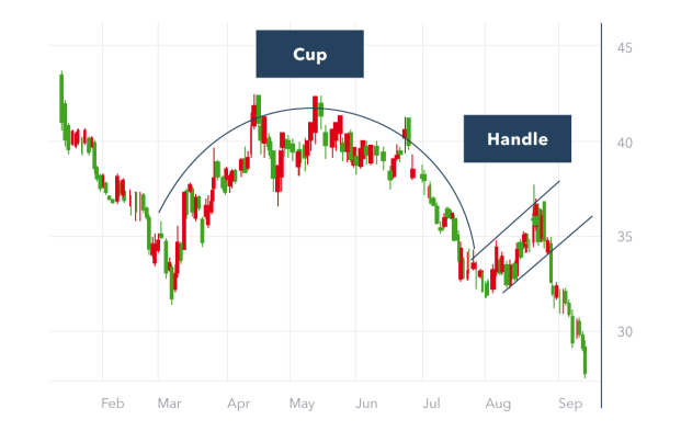
#1. Cup & Handle Pattern
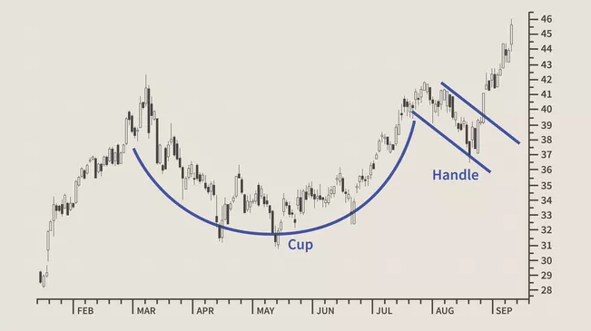
This pattern was first described by William J. O’Neil in this 1988 classic book on technical analysis, ‘How to Make Money in Stocks’.
A Cup and Handle pattern on your crypto’s price chart resembles a cup with a handle, in which the cup depicts the shape of ‘U’ and the handle of the cup has a slightly downward trend.
This pattern signals a bullish flag, with the right side of the chart pattern typically showing a lower trading volume. The pattern can last up to seven weeks or up to even 65 weeks.
When this pattern is formed, it should show a sharp increase in the short- to medium-term.
There are several ways of approaching trading the cup and handle, one of which is to enter a long position. Start by placing a stop buy order slightly above the upper trend line of the handle.
Order execution occurs only if the price breaks the pattern’s resistance. You may experience an excess of slippage and enter a false breakout through an aggressive entry.
At the same time, wait for the price to close above the upper trend line of the handle and place a limit order slightly below the pattern’s breakout level, attempting to get an execution when the price retraces.
#2. The Triangle Crypto Patterns
The Triangle chart patterns refer to the formation of multiple candlesticks enclosed within two converging support lines. The converging support lines depict a triangle shape and indicate the continuation patterns of bullish or bearish market patterns.
In technical analysis, the triangle chart patterns can be distinguished into three types:
- Ascending triangle chart pattern
- Descending triangle chart pattern
- Symmetrical triangle chart pattern
-Ascending triangle pattern
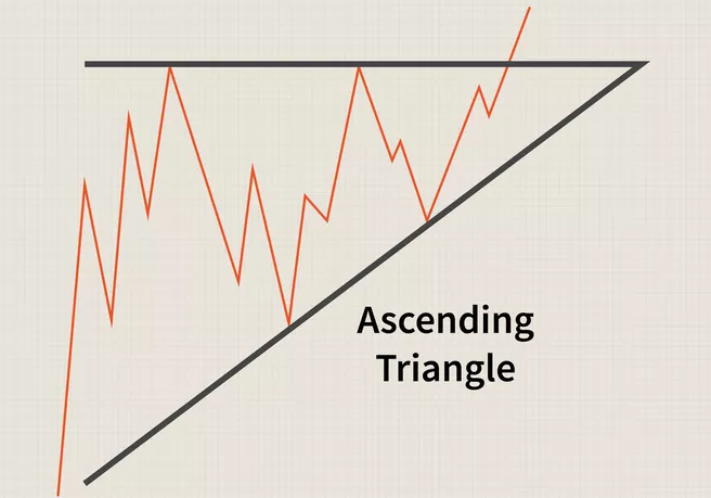
In an ascending triangle pattern, there is a horizontal line and an up-sloping bottom where the breakout is either upward through the horizontal line or downward, piercing the rising wedge.
You will get an Ascending triangle when you connect the minor-highs and a rising line using a horizontal line. The Ascending triangle usually forms after one to two months and is calculated mainly from the beginning of the pattern and not until the apex.
It often represents a bullish trend, and traders mostly take a position once the price breaks past the top line of the triangle with rising volume, which is when the stock price increases by an amount equivalent to the broadest section of the triangle.
-Descending triangle pattern
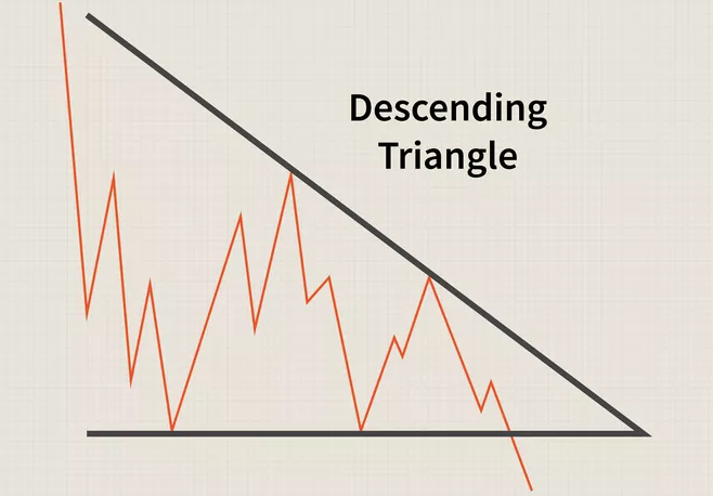
On the other hand, descending triangles represent bearish pattern signals recognized primarily in downtrends. It is just like the upside-down image of the ascending triangle pattern.
The two lows form the lower flat line of the triangle and have to be only close in price action rather than being precisely the same.
The time required for the development of descending triangles is the same as the ascending triangle patterns, and again the volume plays a vital role in the breakout to the downside.
-Symmetrical Triangle Pattern
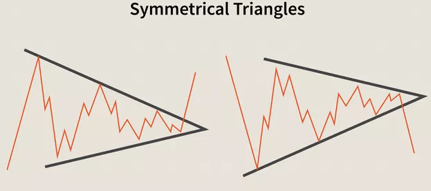
Now that you have looked at both bearish and bullish chart patterns, Symmetrical triangle patterns, on the other hand, are considered continuation patterns that are aimless in direction. The supply and demand, therefore, seem the same.
In this period of indecision, the highs and lows seem to be coming together at the point of the triangle with no significant volume.
When the investor finally figures out which position to take, it heads north or south with a significant volume compared to the indecisive days or weeks reaching the breakout. Which generally occurs in the direction of the already existing trend.
And, if you are looking for an entry point in the symmetrical triangle, jump into the fray at the breakout point.
Keep The Following In Mind When Trading Triangle Chart patterns:
All these trading crypto chart patterns experience early breakouts that give investors a ‘head fake’. So make sure to hold off for a day or two after the breakout and determine whether or not the breakouts are real.
Analysts tend to look for a one-day closing price above the rising trend line in a bullish continuation pattern and below the trend lines in a bearish continuation pattern.
Remember to look for volume at the breakout and confirm your entry signal with a closing price outside the trendline.
#3. Rectangle Crypto Chart Pattern
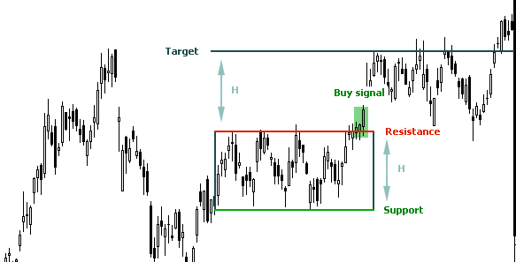
The rectangle chart pattern is a classical technical analysis and is among the most prevalent crypto chart patterns in the trading world. This pattern is described by horizontal lines showing a high level of support and resistance.
Rectangle patterns can be successfully traded by buying at support and selling at resistance level or by waiting for a breakout from its formation and using the measuring principle.
The Rectangle chart pattern is a type of price pattern as well, like the triangle chart pattern. Let me explain how to identify this pattern and how you can bring it to your benefit.
Look at the diagram below where supply and demand lie in absolute balance for an extended period.
The shares move narrowly, hitting resistance at the rectangle’s top and finding support at its bottom. The rectangle can occur over a protracted period or form quickly amid a wide-ranging series of bounded fluctuations.
At times it can also be noted that it can approach a square in proportions. In this pattern, the bull and bear are approximately equally powerful.
The majority of technicians describe that rectangles can serve as both continuation chart patterns and reversal chart patterns. As a reversal chart pattern, it ends a trend either up or down.
As a continuation pattern, it signifies a pause in the prevailing trend with the expectation that the prior trend will eventually resume.
Ultimately, either accumulation or distribution prevails, and the shares break out or break down. Let’s see what support and resistance mean:
- Support is any price point below the current market price where buying should emerge to create, at least temporarily, a pause in a downward trend.
- In contrast, a resistance level is any price above the current market price where selling should emerge to create at least temporarily; a pause is an uptrend.
In a rectangle pattern, ‘significant’ support or resistance is referred to as a price level returned to again and again. On the other hand, trendlines are typically drawn on a diagonal; the diagramming of support and resistance requires horizontal trendlines.
Following are two of the most renowned strategies for trading this pattern:
- The first is to buy at support and sell at resistance (you can also sell short at horizontal resistance and cover the short sale at support). A very tight stop can be employed to mitigate risk if the stock breaks down from support.
- Another method is to wait for the breakout. As with all technical patterns, this breakout should ideally occur on the above-normal volume.
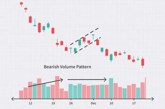
#4. Flag Crypto Patterns
When it comes to technical analysis, a flag pattern in a short time moves opposite to the inducing price trend observed in a longer time frame.
This pattern is among the most common chart patterns used to identify the possible continuation of the previous trend from the point at which the price drifted in that same direction.
As the trend resumes, the price increase could be rapid, making the trade timing advantageous by noticing the flag pattern signals. It can be both a bearish and bullish flag and have five main characteristics:
- The preceding trend
- The consolidation channel
- The volume pattern
- A breakout
- A confirmation where the price moves in the same direction as the breakout
The bullish and bearish patterns have similar structures but differ in trend direction and volume pattern.
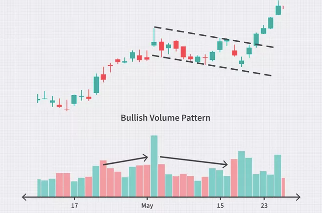
The bullish volume increases in the preceding trend and declines in the consolidation. The bearish volume increases first and then tends to hold a level since bearish trends tend to increase in volume as time progresses.
Using the dynamics of the flag pattern, you can trade such patterns, identifying three key points: entry, stop loss and profit target. Let’s see what they are:
- Entry: Even though flags suggest trend continuation, waiting for the initial breakout is essential to avoid a false signal. Investors typically expect to enter a flag on the day after the price has broken and closed above (long position) the flat upper trend line.
- In a bearish signal, the day after the price has closed below (short position) the lower parallel trend line.
- Stop Loss: Traders typically anticipate using the opposite side of the flag as a stop-loss point.
- Profit Target: New and conservative traders may want to use the difference, measured in price, between the flag pattern’s parallel trend lines to set a profit target.
#5. Head and Shoulders Crypto Pattern
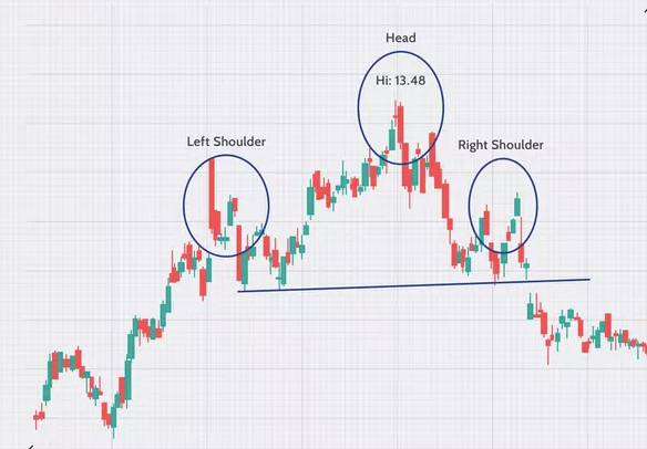
A head and shoulders pattern is a specific chart formation which helps predict a bullish to a bearish trend reversal. This pattern appears as a baseline with three peaks where the outside two are close in height, and the middle is highest.
The head and shoulders pattern is formed when the price rises to its peak and then falls back to the base of the prior up-move. When the price movement gets above the previous peak, forming the “head” and then falls back to the actual base.
Finally, the price then peaks again at about the level of the first peak of the formation before falling back down.
It is among the most reliable trend reversal patterns and one of the top patterns signalling, with varying degrees of precision, that an upward trend is nearing its end.
A head and shoulders pattern has four main components:
- After long bullish trends, the price moves to its peak and subsequently falls forming a trough.
- Then the price rises again, forming a second high, above the initial peak and declining again.
- The price then rises again, a third time, but only to the first peak level, before declining again.
- The neckline is drawn at the two troughs or peaks (inverse).
There is also an inverse version of the head and shoulders chart pattern, which is inverted with the head and shoulders bottoms and is used to predict reversals in downtrends.
The head and shoulders chart pattern indicates that reversals are also possible. Experienced traders believe that three sets of peaks and troughs, with a more significant rise in the middle, mean that the price will begin to fall.
The neckline represents the point at which bearish traders start selling.
Partial patterns should be taken care of, and trades should not be made until the pattern breaks the neckline.
Trade should be initiated once the pattern is completed; plan out beforehand and keep in mind the entry, profit targets and stops, as well as any other variables that can change your stop or profit target.
The most usual entry point is when a breakout occurs—the neckline is broken, and trade is taken. Another requires more patience and comes with an additional possibility that the move can be missed entirely.
This particular method involves waiting for a pullback to the neckline after a breakout has already occurred.
#6. Triple & double tops and bottoms
Triple & double tops and bottoms chart patterns are used to predict the reversal in the movement of an asset’s price.
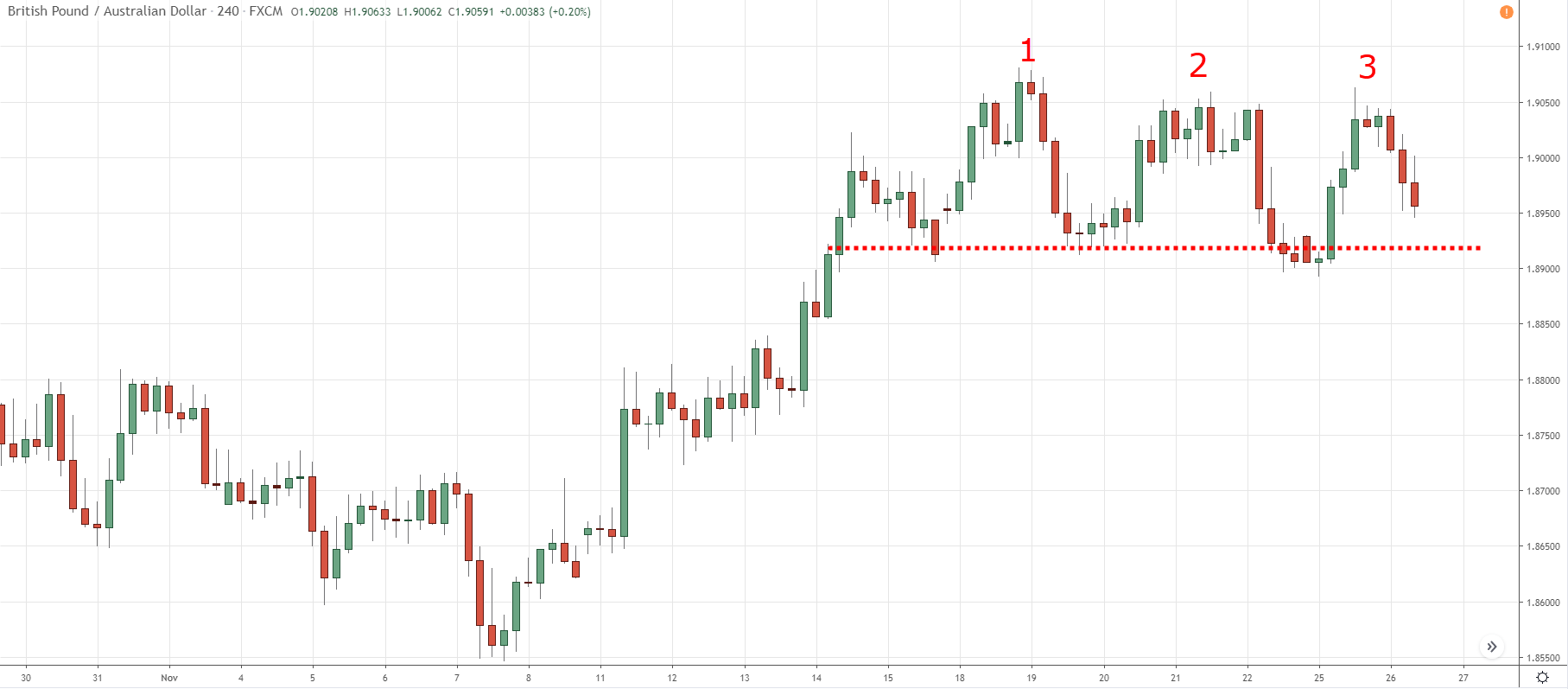
The triple top pattern consists of three peaks, which signal that the asset may no longer be rising at a high rate and that lower prices may be on the way.
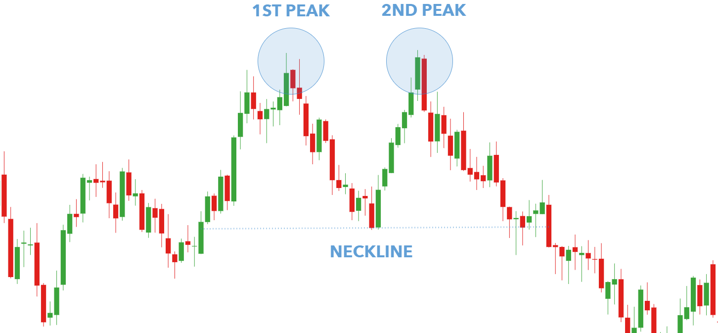
On the other hand, the bearish double top pattern imitates an ‘M’, meaning that there are two peaks and the double bottom chart pattern, as the name suggests, has two drops representing a ‘W’.
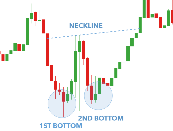
Triple & double bottom chart patterns have similar applications and vary in the number of peaks. These patterns occur when the prevailing price trend creates peaks at nearly the same price level.
The peak area is resistance, and the pullbacks between the peaks are called the swing lows.
After the third peak (triple top) or the second peak (double top), if the price continues falling below the swing lows, the pattern is considered complete, and traders watch for a further move to the downside.
The peaks in the triple top seem similar to the head and shoulders; however, the middle peak is nearly equal to the other two peaks rather than being higher.
Some traders will enter a short position or exit long positions once the asset price falls below the pattern’s support.
Then the support level of the pattern is the most recent swing low following the second or first peak (in double top); subsequently, a trader can connect the swing lows between the peaks with a trendline.
The pattern is only considered complete when the asset price falls below the trendline, and a further price decline is expected.
For additional confirmation, you can also watch for the heavy volumes as the price falls through support. The volume should pick up, showing a strong interest in selling. And eventually, if the volume doesn’t increase, the pattern is like to fail (price rallying or not falling as expected).
Also, the pattern provides a downside target equal to the height of the pattern subtracted from the breakout point, and this target is an estimation. Sometimes the price drops much lower than the target, and other times, it won’t even reach the target.
There are also other technical indicators and chart patterns that can be used in conjunction with the triple top & double top.
For example, a trader may watch for a bearish MACD (Moving average convergence divergence) crossover following the third peak or for the RSI to drop out of overbought territory to help confirm the price drop.
Now, you can either anticipate these formations or wait for confirmation and react to them when it comes to double bottom chart patterns.
Most investors are inclined to place a stop order right below the double bottom or top of the double top. The standard practice says that the trader should get out once the pattern is broken. But standard practices can often go wrong.
Leaving the trade early may seem logical, but markets are rarely that straightforward. Many traders play double tops/bottoms. Knowing this, institutional traders love to exploit the retail traders’ behaviour of exiting early, forcing the weak hands out of the trade before the price changes its direction.
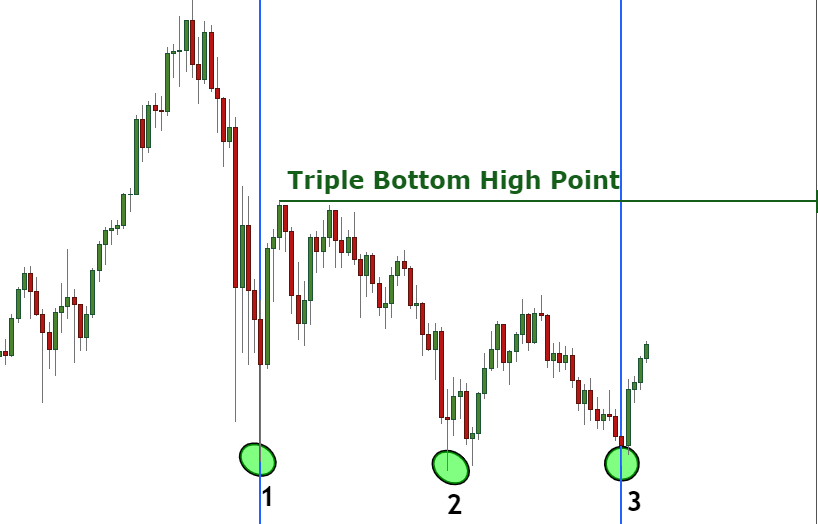
In the case of the triple bottom, they can take anywhere between 3 and 6 months to develop fully. It is a bullish reversal pattern found at the end of a bearish trend and signals a shift in momentum.
This pattern occurs when the price cannot break below a particular resistance level and bounces back thrice. Due to its clear pattern, it is easy to identify the triple bottom pattern.
In simple words, this pattern comes at the end of a downward trend and has three bottoms at a similar level. These patterns are confirmed when the price breaks above the neckline, which in turn serves as a resistance level. When this happens, sellers lose control, and buyers take over.
As you know, the triple bottom is a bullish trend reversal indicator; there is no confusion about how to trade these patterns, especially when looking for the right entry point. This is done when the breakout happens and the asset’s price breaks above the neckline.
To effectively use this chart pattern to your benefit, combining other technical indicators to confirm the reversal and help you find the best price to place a stop-loss order is essential.
Keeping that in mind, I will tell you two useful technical indicators to combine with triple bottom patterns – the Moving Average Convergence Divergence (MACD) and Fibonacci retracement levels.
Let’s see what they are and how to use them:
- Moving Average Convergence Divergence (MACD)
The MACD is among the most popular momentum indicators that are used to spot trend reversals. Although it’s an oscillator, it is not typically used to identify overbought or oversold conditions.
It appears as two lines which oscillate without boundaries on the chart. The crossover of the two lines gives trading signals similar to a two-moving average system.
When you add this indicator to a price chart with the triple bottom pattern, you’ll be expecting a crossover at the exact level where the price breaks the resistance neckline.
Using the same chart from the above example, we inserted the MACD to get another signal for a trend reversal. You will see the MACD crossover has occurred when the price reaches the resistance line and, therefore, helps us confirm the trend reversal.
- Fibonacci Retracement Levels
Fibonacci retracement levels are one of my favourite technical indicators, which you can use with the end number of patterns. It connects any two points that you think are relevant, typically a high point and a low point.
The percentage levels given are the areas where the price could stall or reverse. Fibonacci retracements can be used to place an entry order, set a price target or determine a stop-loss level.
These levels are static, unlike moving averages. The static nature of the price levels provides quick and easy identification and helps anticipate and react effectively when the price levels are tested.
For instance, when the price bounces back following three attempts to break the resistance line. The break occurs at an exact Fibonacci level, which confirms the breakout.
#7. Cup & Handle Pattern (inverse)
I told you about the cup and handle pattern initially; as the name suggests, this pattern is the inverted version of that.
An inverted Cup and Handle can be identified by their large crescent shape followed by a less extreme, upward retracement just like the former Cup and Handle pattern but is just inverted, as I said. The pattern usually takes 3 to 6 months to develop and is meant to dictate a bearish reversal pattern. Now let’s discuss how to trade this pattern.
One way is the follow-up, where it retraces the initial move, but not to the level of the original trade. Setting a stop loss order while selling the trend would be the best idea as soon as you see a retracement in the form of an inverted handle.
After the cup is formed and the beginning of a noticeable handle takes shape, start monitoring the trade volume closely. You might observe a steady and daily drop in volume that could strongly indicate the end of the handle’s formation is near.
Before you enter these trading patterns, keep the following points in mind:
- Enter a short position after observing a trade volume drop for a few days.
- Enter a short position after a retracement of the handle.
- Additionally, placing a ‘stop loss’ order as you enter your position could limit potential losses or lock in any potential gains.
FAQs:
– Do chart patterns work in crypto?
The reason I have told you about these chart patterns is that these patterns effectively work in the cryptosphere. All the patterns and indicators that I have told you about will come in handy when you trade.
And given the present situation, it is essential to learn these to execute profitable trades and turn the market to your benefit.
– How many chart patterns are there in crypto?
The chart patterns I have enlisted are the most common crypto chart patterns you should know about to get the most out of crypto trading.
These are the patterns which are essential in the crypto world:
- Cup & Handle Pattern
- Triangle Crypto Pattern
- Rectangle Crypto Pattern
- Flag Crypto Pattern
- Head and Shoulders Crypto Pattern
- Double/Triple Tops and Bottoms Chart Pattern
- Rounded Top and Rounded Bottom Chart Pattern
- Failure Swing Trading Chart Pattern
– How to analyze crypto chart patterns?
Following the instructions I told you about throughout the article, you can easily analyze crypto chart patterns through patience and careful observations.
To gain hefty profits from the market and risk management, it is essential to be patient and an opportunist. And this skill comes with experience, so apply the knowledge I told you about and execute profitable and controlled trades.
Conclusion
That was all you need to know about trading cryptocurrency chart patterns; feel free to post your queries in the comment box below if you have any.
I am sure now you will be able to use all these trading patterns and see how these patterns will optimise your overall trading experience and help you skyrocket your profits.
These trading chart patterns are essential to understand to execute controlled trades and now that you are a master of them all, go trade with complete confidence.
- Is Bitcoin Real Money?: Understanding Different Types Of Money - June 28, 2024
- Bitcoin Transaction Accelerator: 5 Services to Unstuck Your BTC - September 23, 2023
- What Is Bitcoin Private Key? Everything You Need To Know !! - June 2, 2023
Contents